
Tags
Avengers, Banner, Batman, Campus Comics, Chip Kidd, comic books, Comic Shop, comics, Dark Horse, dc comics, designer, Detective Comics, Image, Marvel, Mike Noe, NoeMan's Land, Salem Comic and Toy Expo, SHIELD, sign, signage, Spider-Man, store, Superman, window, Wonder Woman, X-Men
If you’ve been following this blog you”ll know that you haven’t had anything to follow for a while. One of the things I was working on in the interim is designing a new sign and window graphics for my local comic shop, Campus Comics.
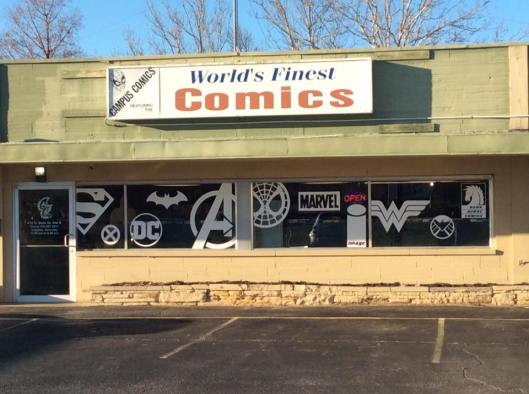
Last year Campus Comics came under new ownership and Mike Noe, the new owner, determined a new sign was needed. His daughter Sarah designed a new logo for the store and Mike consulted with me on a sign.
This is what resulted.
I created a sign utilizing the new logo and added a background to match some of the other marketing created for the store. We also produced a smaller NoeMan’s Land sign to promote the owner’s online presence.
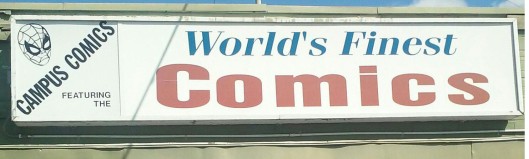
For contrast, here is the comic shop’s previous sign used for the last several years.
We decided a more colorful sign was necessary to attract attention from the busy street the store is on and also to set it apart from the other stores in the shopping center.
Utilizing the busy street was also the thought behind the graphics for the windows.
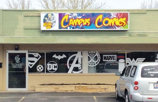
This is the store when the window graphics were installed before the new sign.
There was a desire to grab people’s’ attention as they sped by and clearly state “we have comics here.” White logos were used to stand out from the dark windows and provide a unity to the various designs.
I decide to enlarge the logos to the extent that some of them run off the windows to grab the eye. The Superman “S” is very recognizable to the point that it is easy to pass by. By cropping parts of the logos they stand out as “not being right.” Chip Kidd used a similar technique when he redesigned the trade dress for the Batman books back in 2000. By placing the DC logo in the corner and truncated, it stood out way more than it did on the plethora of other covers it was on then.
So yeah, I’m on par with Chip Kidd, basically.
Below is a banner I created also to be used at conventions for the store.
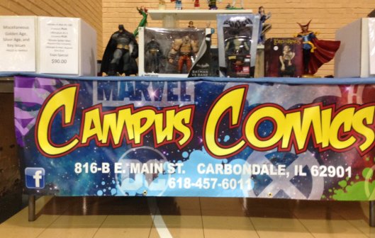
Here it is at this year’s Salem Comic and Toy Expo in Salem, IL.
The main idea here was to create a banner that tied into what had been done for the store signage.
All in all, I am pretty pleased with the way all of these turned out. More so, than my typical work that is beaten to death by clients’ “input.” The response to these has been overwhelmingly positive, or as far as I know it has. Unless everyone is lying to me to my face.
Customers who haven’t been in a while are typically taken aback by the improved look of the store now and I knew it would start with how the store looked on the outside.
You can check out more about Campus Comics here: https://www.facebook.com/pg/Campus-Comics-175604092464496/photos/?ref=page_internal
or you can come by the store and check it out for yourself.

Pingback: Batman Day Week Part 1: The Bat-Haul | detective651